
TL;DR
Color can influence attention, recognition, and perception in the feed, but it is not a standalone click lever.
In fast-scrolling environments, contrast and legibility often matter more than symbolic color meaning.
Universal advice like “red converts” or “blue builds trust” is too simplistic to guide serious feed design.
The most reliable way to use color is through a repeatable system of brand rules, testing logic, and review criteria.
Tareno’s Brand Kit fits best as a consistency layer for teams, not as a shortcut to guaranteed performance.
Quick Definition
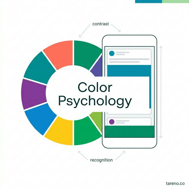
Color psychology in the feed is the deliberate use of color, contrast, and recurring visual cues to improve recognition, comprehension, and brand fit in fast-scrolling environments. It is not a magic trick for clicks. It is one part of the larger system that shapes whether someone pauses, understands the message, and wants to act.
The headline question — “30% more clicks?” — should be treated as a testing hypothesis, not as a fact. Research supports the idea that color can influence perception and behavior, but not in a universal, one-color-fits-all way. Platform performance is multi-factor by nature, so color can help, but it never works alone.
A practical way to think about color is simple: color should support comprehension before it tries to signal emotion. If a post is hard to read, hard to recognize, or visually off-brand, the palette is not helping no matter how trendy it looks.
Why colors matter in the feed at all
Color is not just decorative. It works as a fast sorting mechanism. Before someone fully reads a headline or swipes through a carousel, they already make a judgment: clear or confusing, relevant or generic, polished or noisy. That early filtering affects whether the user pauses long enough to process the message.
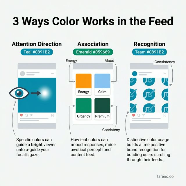
Color works through three mechanisms in fast-scrolling feeds — attention, association, and recognition.
Three mechanisms matter most:
Attention direction: contrast and accent colors can guide the eye toward the headline, product, or callout.
Association: colors can suggest energy, calm, urgency, restraint, or premium positioning.
Recognition: repeated color systems help audiences identify your brand faster over time.
Imagine two carousel covers on the same topic. One uses washed-out text on a pale background with no focal point. The other uses a stable brand background, one strong accent color, and clear type hierarchy. The second does not win because it found a secret “winning color.” It wins because color helps structure attention.
That is also why color should never be framed as the sole reason a post performs. Feed performance emerges from topic fit, hook strength, clarity, timing, audience relevance, and platform interpretation. For the broader platform context, Tareno’s article on the TikTok algorithm and leaked docs is a useful reminder that no single creative variable explains distribution on its own.
What color psychology cannot do
There is no universal “best color” for more clicks, more saves, or more conversions across all feeds, audiences, and offers. A color only means something inside a context: brand category, audience expectation, neighboring elements, saturation, contrast, and message intent.
Blue is a good example. In one context, it can support trust, calm, and professionalism. In another, it can look generic because every competitor also chose the safe corporate route. Red can feel urgent and energetic, but it can also look cheap or too aggressive for the topic. The same palette that works for a flash sale can damage the credibility of a finance, healthcare, or premium education brand.
If a hook is vague, the topic is weak, or the value proposition is unclear, a better palette will not rescue the post. Strong design can amplify a strong message. It cannot repair a poor one.
The practical value of color in social media is rarely about abstract symbolism alone. It is about whether a design is readable, recognizable, and appropriate for the brand context in which it appears.
The CLARITY Framework for feed color decisions
To stop color discussions from collapsing into taste, teams need an operating model. A practical one for social content is the CLARITY Framework:
C — Context
Start with the setting. Which platform, format, audience, and decision stage are you designing for? A TikTok cover, a LinkedIn carousel, and a Pinterest pin may all use color differently because the surrounding feed expectations differ.
L — Legibility
Can someone understand the main message immediately on a mobile screen? If not, any deeper conversation about emotional color meaning is premature.
A — Association
What mood or category signal does the palette create? Does that support the brand and the topic, or does it introduce confusion?
R — Restraint
More color is not automatically better. Too many accents flatten hierarchy and make everything feel equally loud.
I — Iteration
A single post proves very little. Color psychology becomes useful only when teams test patterns across a series of related creatives.
T — Template System
If the logic is not documented, the same argument returns every week. Templates turn subjective design choices into repeatable operating rules.
Y — Yield Review
Review what actually happened. Not just what the design team liked, but what improved comprehension, clicks, saves, comments, or profile actions over time.
This framework shifts the conversation from “Which color wins?” to “Which color decision is readable, on-brand, and testable in this context?” That is a much more useful question.
Which colors often signal what — and when that breaks down
Color tendencies can be useful if treated as tendencies, not laws.
Warm colors such as red, orange, and strong yellow often feel more immediate, energetic, or promotional.
Cool colors such as blue and green often feel calmer, more controlled, or more stable.
Neutral palettes can feel editorial, premium, or restrained when used with enough contrast and hierarchy.
But those associations break down quickly when context changes. A premium skincare brand may weaken its perceived quality if every campaign starts to look like a discount banner. A creator brand may gain energy from bold, warm accents, while a compliance-heavy brand may lose trust if it pushes too hard into excitement cues.
The point is not to memorize symbolic meanings. The point is to judge whether the visual signal matches the brand promise and content goal.
Contrast beats symbolism more often than marketers admit
In everyday social work, marketers tend to overestimate symbolic color meaning and underestimate readability. That is backwards. In a feed environment, people need to grasp the message before color can shape emotional interpretation in any useful way.
This matters most when your content includes text overlays, carousel slides with numbers or steps, educational posts viewed on mobile in daylight, or visuals that need to remain usable for a broad audience. If the text is too faint, the background is too busy, or the hierarchy is unclear, the post loses practical value before any subtle emotional cue can help.
That is why accessibility principles matter here. W3C contrast guidance was not written as a growth hack for social media, but it captures an important truth: if people cannot distinguish text from background easily, usability drops. In real feed terms, that usually means slower comprehension and lower practical effectiveness.
Color can influence feed performance, but not as a standalone growth lever. In practice, contrast, legibility, context, and brand consistency usually matter more than simplistic claims about one “winning” color.
This is also where visual clarity connects to discoverability logic more broadly. Good feed performance is not only about being seen; it is about being understood quickly. That makes this article a natural companion to Tareno’s piece on Instagram SEO and why keywords often matter more than hashtags.
Step by step: how to test color psychology without falling for design myths
A useful color strategy is not built from one lucky post. It comes from a repeatable testing process.
Brand system thinking outperforms color hacks — consistency and testing create measurable results.
1. Pick a primary metric
Decide what the test is trying to improve: clicks, saves, profile visits, watch-through, or carousel completion. Without a primary metric, every review becomes subjective.
2. Define a base palette
Start with a core palette, one or two accent colors, and clear type/background rules. That keeps testing inside a recognizable brand system rather than turning it into random experimentation.
3. Test creative families, not isolated one-offs
Compare a set of posts built from the same concept structure. For example, three educational carousel covers with similar hooks and layout, but controlled color treatment. Pattern-level learning is more useful than winner-post storytelling.
4. Change only a few variables at once
If color, wording, layout, image choice, and format all change together, the test teaches you almost nothing. Keep the comparison narrow enough to interpret.
5. Log qualitative observations too
Quantitative performance matters, but teams should also record what looked clearer, more premium, more trustworthy, or more aggressive. Those notes help explain why a pattern is working.
6. Formalize review rules
Once multiple people create content, informal taste is no longer enough. Teams need documented rules for color hierarchy, contrast thresholds, and exceptions.
For teams that publish at scale, documenting these rules matters as much as choosing them. This is where a shared Brand Kit becomes practical: colors, typography, aesthetic tags, and asset context live in one place, so every new post starts from the same guardrails instead of restarting the discussion from scratch.
7. Run tests serially through a workflow
Color tests are easier to evaluate when similar creatives move through a visible process. A clear approval status, a content calendar, and a publishing queue reduce last-minute design drift and make serial testing easier to review.
When to use color psychology — and when not to
Color psychology is worth using when your brand depends on visual recognition, publishes repeatable content series, or needs a stable creative system across multiple team members. It is especially useful for carousels, covers, thumbnails, quote cards, and educational series where hierarchy and recognition do real work.
It should not be treated as the main lever when the real problem is weak positioning, unclear offers, poor topic selection, or inconsistent content quality. If the message is not worth stopping for, color alone will not fix that.
Edge cases teams regularly miss
Dark mode and ambient light
Designs that look elegant on a calibrated screen may collapse on a phone outdoors. Mid-tone palettes, thin fonts, and low-contrast overlays are especially vulnerable.
Series content vs campaign exceptions
A campaign can bend the visual system for a special moment. A weekly content series usually should not. Repetition builds recognition.
Organic vs paid creatives
Organic content often benefits more from long-term consistency. Paid creatives allow more aggressive variation, but trust and legibility still matter.
Early-stage vs mature brands
Newer brands usually gain more from consistency than from experimentation. Mature brands can afford more nuanced color segmentation because recognition already exists.
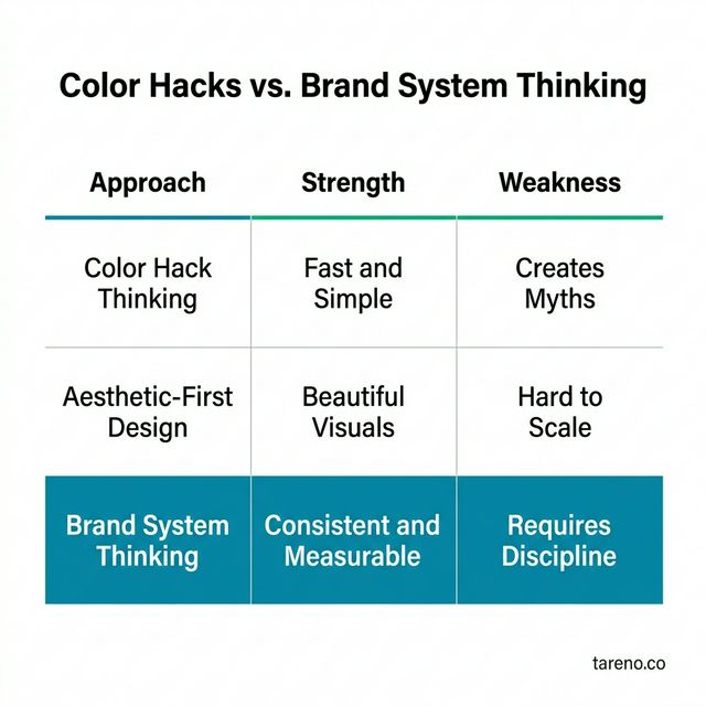
Comparison: color hacks vs brand system thinking
ApproachStrengthWeaknessBest fitColor hack thinkingFast, simple, emotionally appealingCreates myths and random decisionsBeginners looking for shortcutsAesthetic-first without testingCan produce beautiful visualsHard to scale and hard to explainSolo creators with strong visual instinctBrand system thinkingConsistent, trainable, measurableRequires discipline and documentationTeams, brands, and agencies
If you want another example of why systems usually beat isolated tactics, Tareno’s article on hashtag research tools makes the same point from a discovery angle: repeatable process outperforms one-off cleverness.
How to operationalize color decisions across a team
When more than one person touches the feed, color choices become an operations problem, not just a design problem. Teams need defined palette rules, contrast standards for text-heavy surfaces, clear rules for CTA and highlight states, repeatable templates for recurring post types, and review criteria that prioritize comprehension over personal preference.
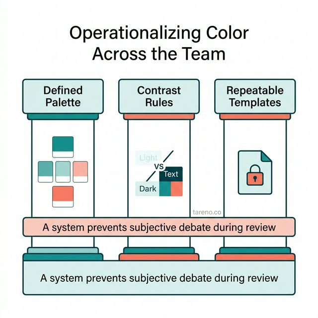
When multiple team members touch the feed, color decisions become an operations problem — not just design.
A tool like Tareno’s Brand Kit is useful here because it centralizes the visual system behind the content. Instead of relying on memory, chat messages, or scattered files, teams can keep color rules, typography choices, and brand context aligned across recurring formats.
And if consistency has to extend across channels, the logic also connects with articles like Pinterest automation, where repeatable visual systems matter for scaled publishing.
FAQ
Is there a best color for getting more clicks?
No. There are more and less useful color choices in specific contexts, but there is no universal winner color across platforms and industries.
Does color psychology work the same on Instagram, TikTok, and LinkedIn?
No. Platform norms, pacing, audience expectations, and format conventions change how colors are perceived and how much visual restraint is appropriate.
Is contrast more important than brand color?
In many feed situations, yes. If the post is hard to read, brand color alone will not save it.
How many color variants should a team test at once?
Usually fewer than teams think. Two or three clear directions inside the same creative family are often more useful than a chaotic spread of unrelated variants.
What is the most common feed-design mistake?
Optimizing for attention without optimizing for immediate comprehension.
Can the same colors work in every industry?
No. Category norms, cultural expectations, and brand positioning all shape how a palette feels.
Key Takeaways
Color should support comprehension before it tries to signal emotion.
Color matters most when it improves clarity, recognition, and fit — not when it chases myths.
Contrast is often the most practical performance lever inside color decisions.
Consistency creates recognition, and testing creates confidence.
A documented visual system is more reliable than color folklore.